This website has been dead for a pretty long time now. If you got here some how, please head over to my new official website at www.robinbervini.com
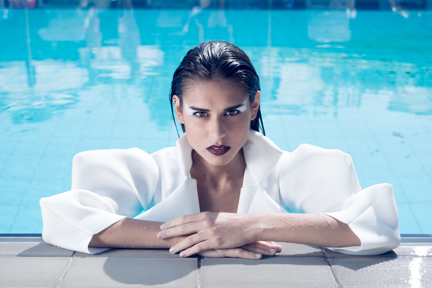
Aqua – Directed and styled by Giorgia Motta
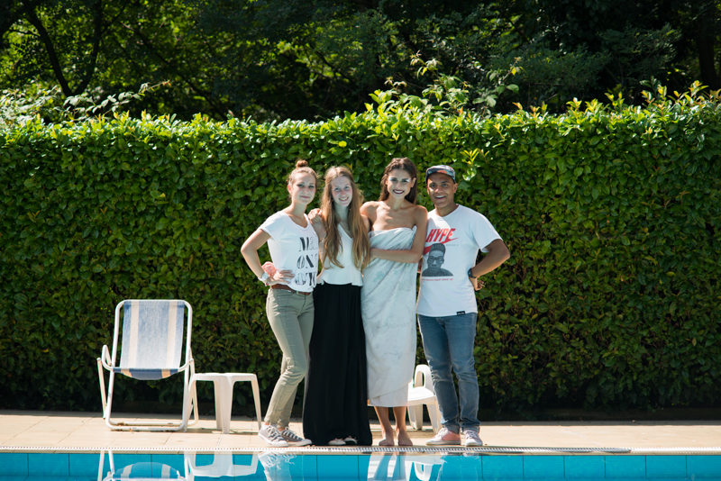
One of my latest works has been a collaboration with Giorgia Motta, a Fashion Design student who attended the New Academy of Fine Arts (NABA) in Milan. For her thesis project she designed and crafted apparel and needed to photograph her project in a fashion editorial way. She came up to me showing me the project’s moodboard which was themed around water – hence the title aqua – and organized the shooting at a pool near Varese (Italy) with a local model and make-up artist. Here’s a little outtake, there’s a complete set on my flickr and on tumblr.
Aqua – A styling project by Giorgia Motta
Model: Valentina Mascioni
Photographer: Robin Bervini
Stylist: Giorgia Motta
Make-up Artist: Martina Mattioni
Clothes designed and crafted by Giorgia Motta, shoes and sunglasses by Zara.

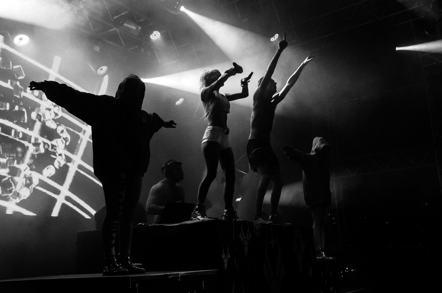
About shooting Die Antwoord show in Zofingen
It seems like birthday gifts came earlier this year as I’ve been given free VIP tickets and All Access tickets (for me and my assistant sister) for the Die Antwoord show at the Heitere Open Air in Zofingen, Switzerland. I am a big fan of these guys so meeting them again and being able to see their show for the fifth time, but this time while taking pictures from the stage is the best thing that could happen to me. I’m uploading few pictures during these days on my tumblr and instagram so stay tuned there for more.
My work featured on FeatureShoot.com
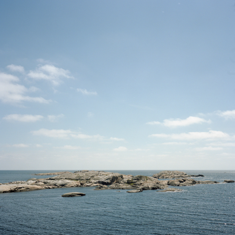
Scandinavian Holidays, part 1
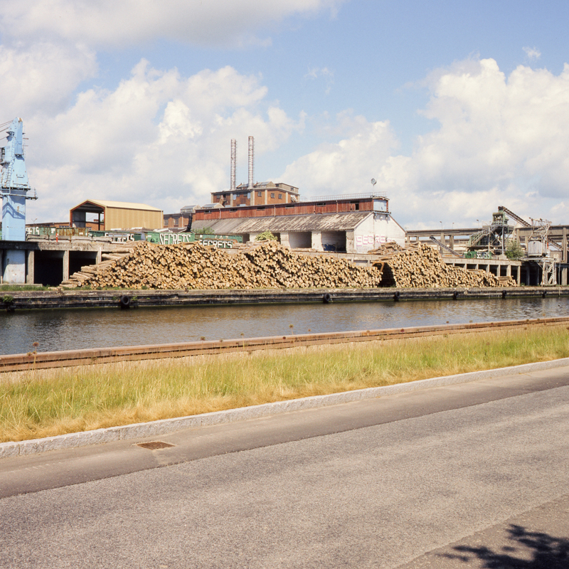
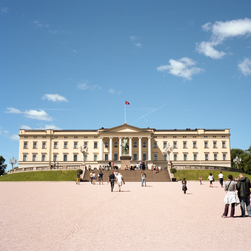
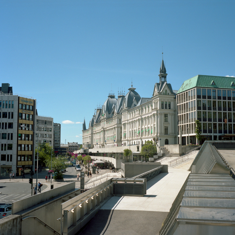
In June I have spent two weeks in Northern Europe during which I visited Denmark (Copenhagen, Næstved, Faxe) and Norway (Oslo). Every time I pack up for a journey the hardest part is to choose which cameras take with me. This time I left all the Polaroid cameras at home, my weapons of choice were a 35mm Minolta X-700 with a 50mm prime lens, my 6×6 Zeiss Ikon and a sloppy waterproof Olympus compact camera. It was really a pleasant journey, Danish people are the kindest, the amount of light during the 24 hours was absurd (I didn’t see the sky go black in Oslo) and so were the prices. I have been blessed with sunny weather for almost my whole staying and I went swimming in the sea. Oh, and I got my iPhone 5S stolen but somehow I got it back, long story.
I shot 4 35mm rolls and 3 120 rolls. I haven’t scanned the 35mm film yet, so here’s some pics took with the Zeiss Ikon.
Denmark
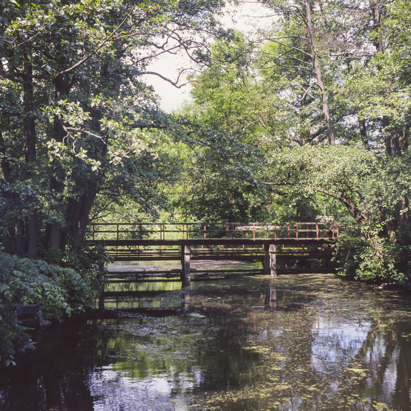
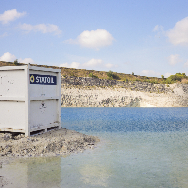
Norway
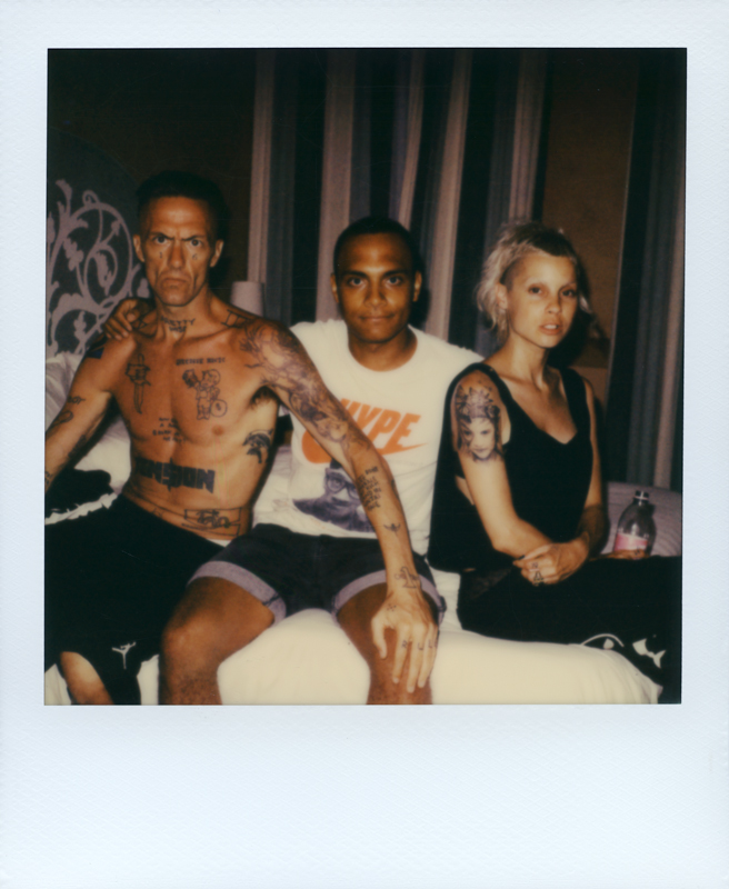
Shooting Die Antwoord in Venice
Last month (June) I had the chance to meet Die Antwoord with their crew and spend a day with them in Venice while taking some pictures of them. I took my sister with me as assistant, she really helped me in switching cameras and taking them around. I should get used to it!
We spent the afternoon at the beach, and in the evening we went out for a gondola ride and they were wearing masks they bought in Venice. I took the best shot on 4×5″ negative film, but I’m not going to publish it for the moment. I don’t want to spend many words on the day, I’ll let the pictures talk. I’ve already released some of them on tumblr and instagram (look for @robinbervini and follow me!), and also Die Antwoord did.
At the beach
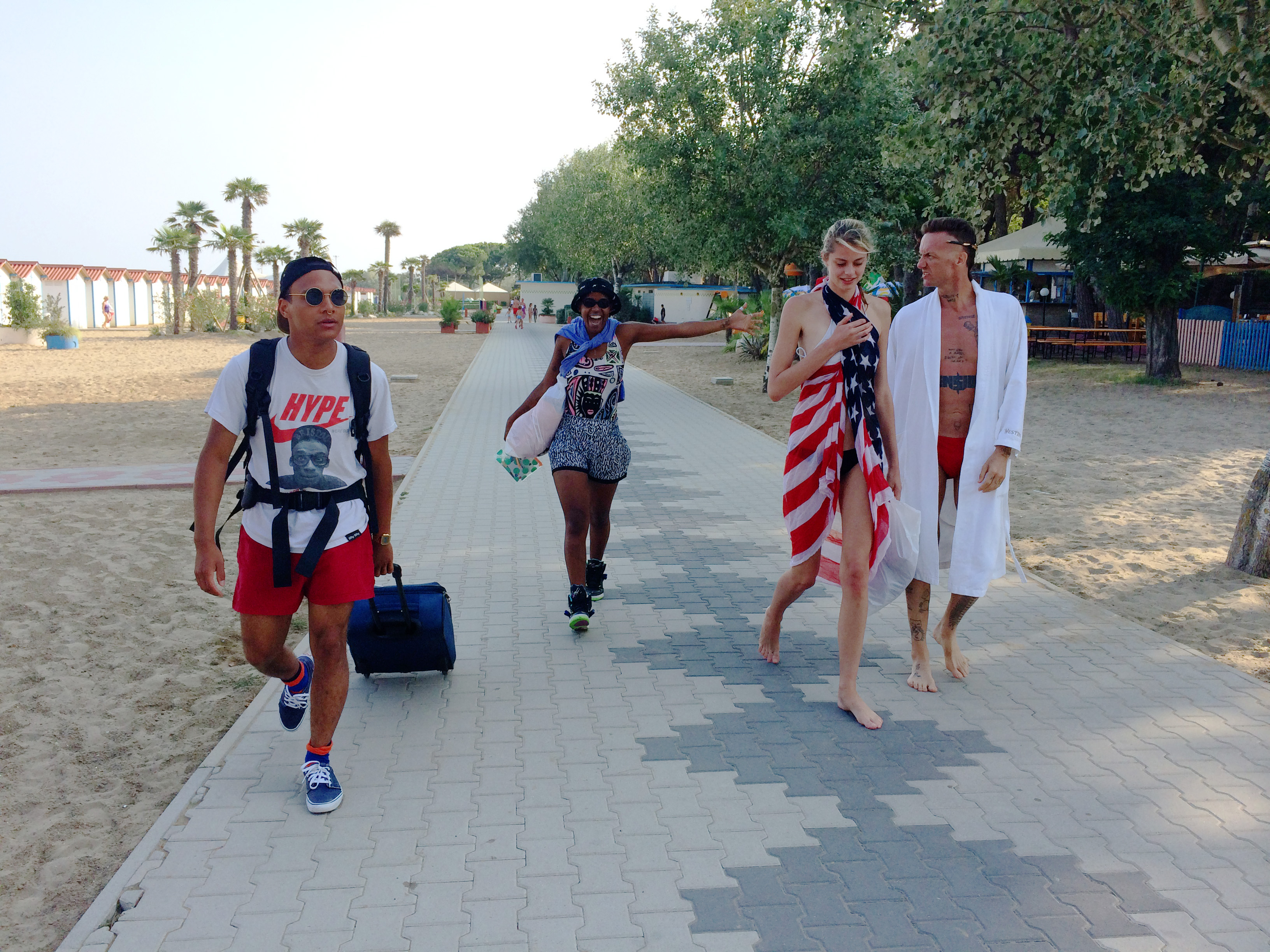

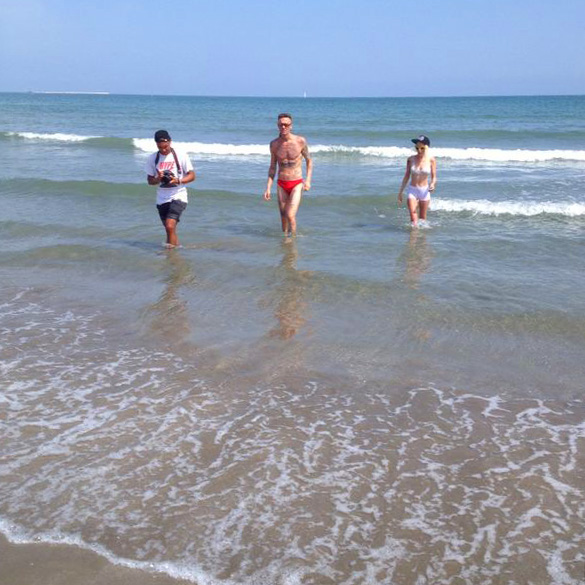
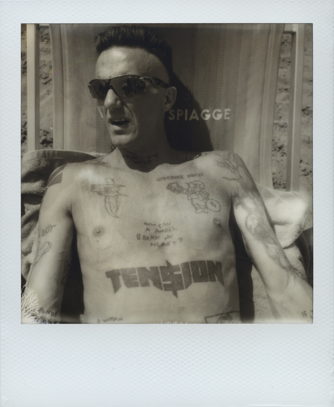
Leaving the beach


Evening


Gondola ride


And bye bye
4×5″ test with Cate
As I have bought accessories for my large format camera I decided to give it a try on 4×5″ color film (I only tested on 4×5″ black and white film and instant film in case you hadn’t read about it) and my mind was blown away from the result. The large size of the film something magnificent, I know it’s kind of “duh!” but really, when you scroll down a 3200dpi scan at 100% zoom the feeling is like you are never getting to the bottom. What is really interesting is that at this size it is possible to crop little parts of the picture and still have a pretty big image to work with.
So my friend Cate has kind as always and posed for my test. I’m posting the complete photograph (not at actual file size) and a little crop of it just to explain myself better. This one was taken on Fuji RDP III color reversal 4×5″ film.
Other film scans from the shooting with Luna in Zürich
Here are some other picture from the shooting with Luna Leung. I only posted polaroids earlier but I also used 35mm Lomography color negative film and Kodak Portra 400 120 film.

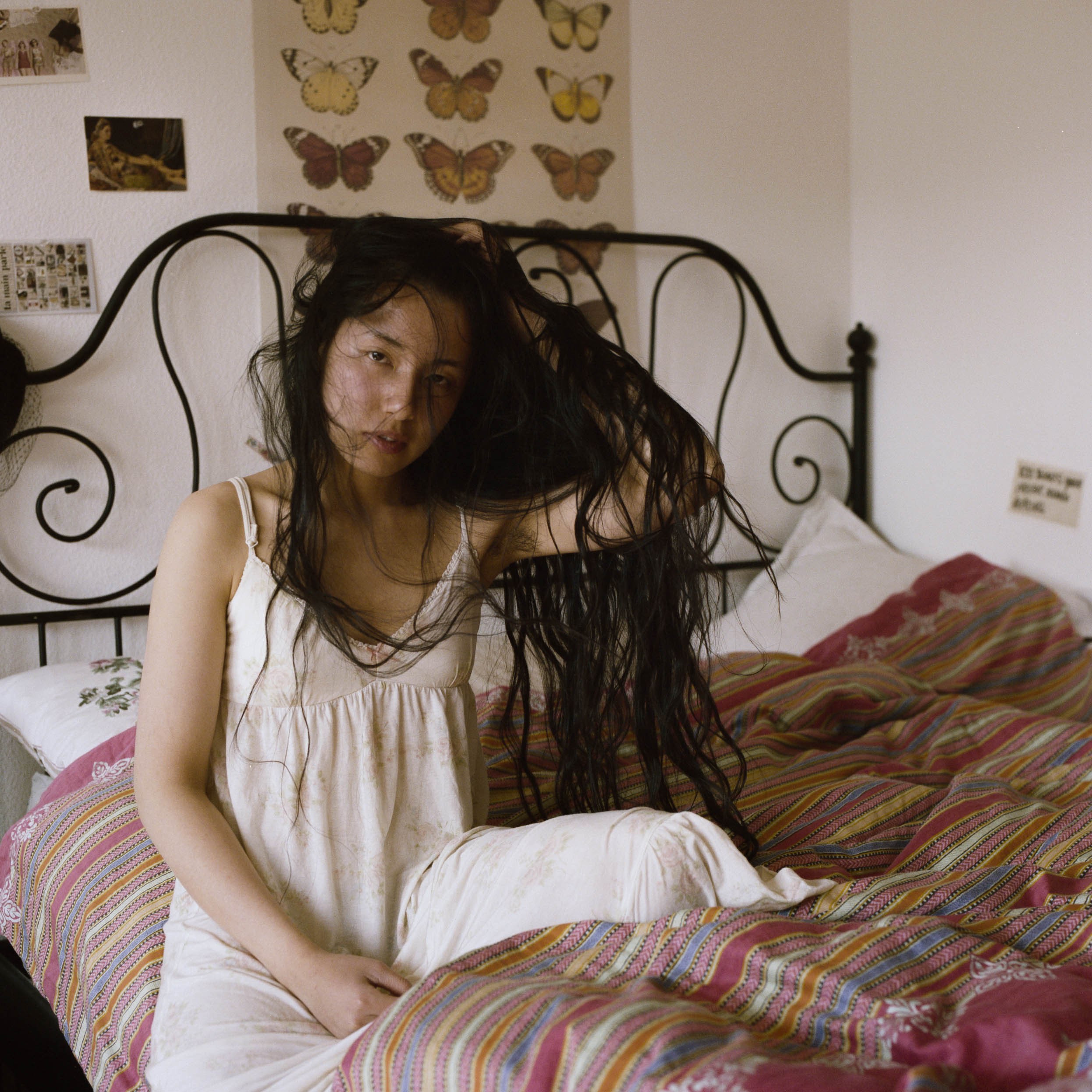
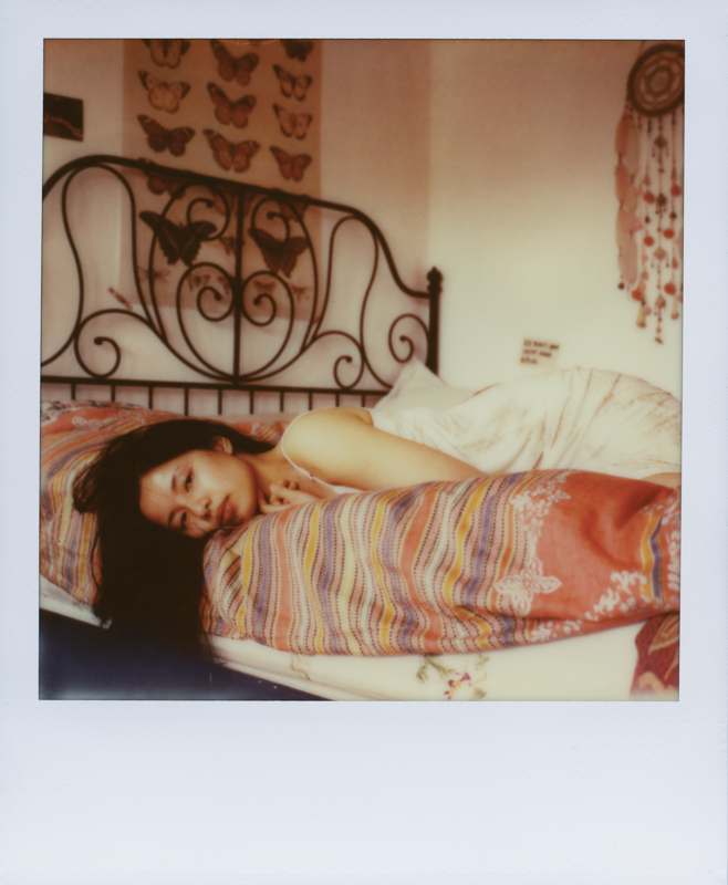
Polaroid previews from a shooting with Luna Leung
Two weeks ago I did a shooting in Zürich with Berlin based chinese model Luna Leung. I shot about 30 Polaroids and some roll film I still have to get developed but here’s some ’roids as a sneak peek and to continue my review on the latest Impossible films. The shooting went straight and was a lot of fun. Luna is great and besides modeling she does natural soaps and natural cosmetics. Check out her website.
In my last post I did a review on Impossible Project’s SX70 Color film. In this case I shot on 600 Color film (prod. 01.14) and SX70 BW film in different light conditions.
In the picture above there was a lot of direct sunlight entering the bedroom and a warm color cast is easily noticed. Most of the picture of that day have a similar color rendition.
In this second picture all the ambient light was shaded and the difference in the colors is quite surprising. The overall picture has a cooler color cast and is less saturated. These pastel colors are more fairy and the image is not as sharp as the others (not sure if this can be related to color temperature though). I wonder how much I can take control of these different rendition using on lens filters.
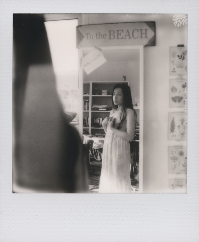
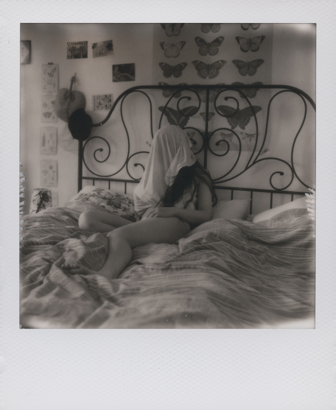 The black and white film looks sharp and holds details pretty well. High contrasts are easily achieved by overexposing the image a little bit. Pictures are developed pretty quickly (about 5 minutes) as usual.
With color film I only got few undeveloped patches shooting with a folding camera. It seems like the emulsion density has been improved so that annoying patch doesn’t happen as often as older production films. The same goes for BW film, 0 undeveloped patches out of 8 pictures. Other tests with filter will be posted soon!
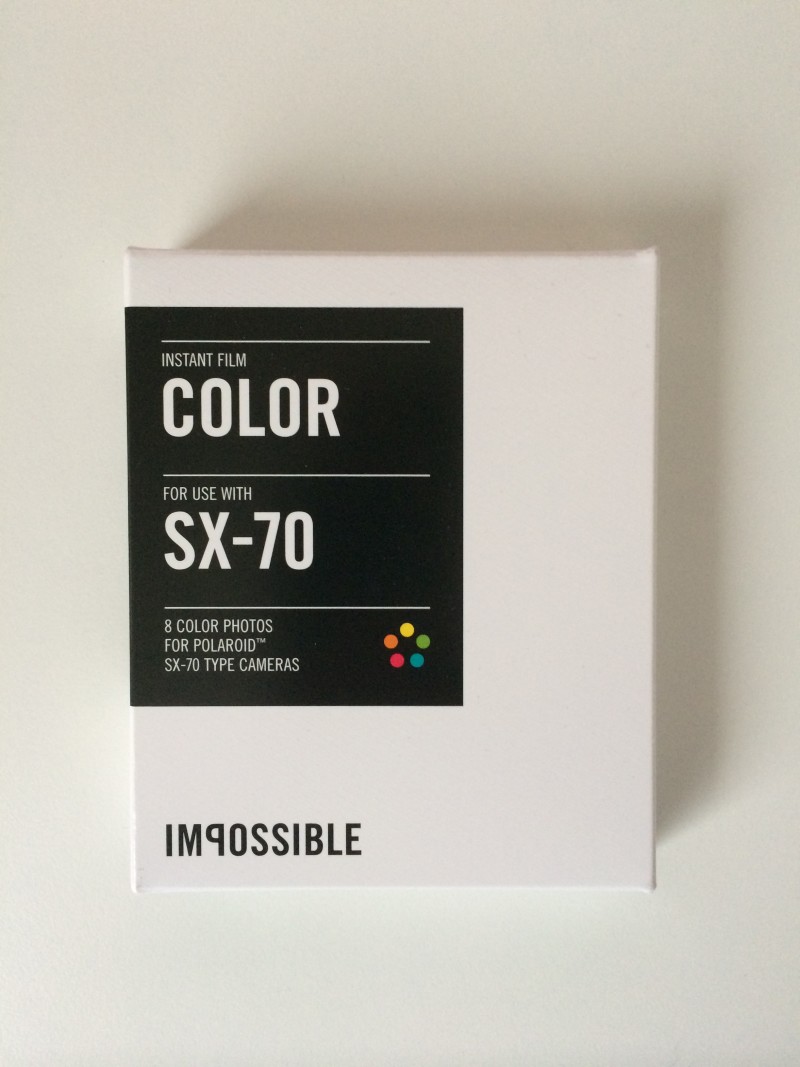
Outdoor test with latest Impossible color film (prod. 01.14)
I recently bought a stock of color and black and white film for both SX-70 and 600 Polaroid cameras as I was running short on film and wanted to try the last generation of film. Yesterday was a sunny day and so I brought a SX-70 camera and a pack of Impossible SX-70 color film produced in January 2014 (01.14 marked on the film pack).
I wasn’t really impressed with the results, I was expecting better color rendition. Even though the weather was sunny it was also pretty cold, so I think that could have been the matter in the color rendition. There is a green-yellowish color cast in highlights and a pink-purple cast in shadows. This really reminds me of the old “PX-70 Push!” film and kind of bothers me. The blue of the sky is totally missing this way. I will have to test the same film in cloudy weather and let it develop in warmer environment, and try shooting with studio flashes. I hope to get more accurate colors, if not I will simply learn how to get the best out of this film with lighting and filters. I’ll test the 600 color film soon too and let y’all know.